
B2B demand generation has spent the better part of a decade trapped in a repetitive, low-yield cycle. A marketer creates an in-depth whitepaper, builds a dedicated landing page with a six-field form, and pours budget into sponsored content to drive traffic to that page.
The resulting metrics are painfully familiar. Most paid clicks bounce within three seconds because the page takes too long to load on a mobile device. The visitors who stay are asked to hand over their corporate email, phone number, and company size before seeing a single paragraph of proof. Unsurprisingly, conversion rates hover in the low single digits. Buyers have developed an instinctive defense against blind gates because they have been burned too many times by twenty-page sales brochures disguised as research.
LinkedIn Document Ads solve this friction by fundamentally changing the terms of the trade. Instead of demanding contact details up front, they allow prospects to preview the work directly inside their professional feed. When configured with a native Lead Gen Form, the format strikes a rare balance: it proves your expertise before asking for a commitment, while still delivering clean, verified first-party leads.
Gating a document inside the feed is not just a technical toggle, however. It requires a deliberate editorial structure, disciplined visual formatting, and a clear understanding of buyer psychology.
The Anatomy of a Feed-Native Document Preview
The fatal mistake most teams make with Document Ads is uploading an existing print-ready PDF and slapping a gate on page two. When a user swipes past a generic cover page only to hit a wall immediately, the ad feels like a bait-and-switch. It replicates the exact friction of an external landing page without providing any of the context.
To make gated Document Ads work, you must adopt the principle of the proof-of-work preview. The preview pages should act as a self-contained executive brief that delivers immediate, standalone value while establishing an undeniable reason to download the full asset.
Aim for a preview sequence of three to five pages before triggering the form:
-
Page 1: The Explicit Hook. Your cover slide must bypass generic industry jargon. State the core diagnostic problem your research answers and name the intended audience directly.
-
Page 2: The Core Insight. Share a compelling data point, a proprietary benchmark, or a counterintuitive observation right away. This proves that real analytical work went into the publication.
-
Page 3: The Strategic Framework. Present the conceptual model or diagnostic methodology that underpins your solution. Show the reader what the problem is and why traditional approaches fail to resolve it.
-
The Gate: The Tactical Cliffhanger. Position your native form at the precise moment where conceptual diagnosis turns into operational execution. If pages two and three outline the strategic framework, the gated remainder should house the step-by-step implementation playbooks, toolkits, vendor scorecards, or granular datasets.
By the time the prospect reaches the gate, they are not guessing whether the content is worth their business email. They have already consumed tangible proof of quality, making the decision to complete the form natural and frictionless.
Designing Assets for Feed-First Consumption
A whitepaper designed for desktop reading or print distribution will fail in the LinkedIn feed. Most feed consumption occurs on mobile screens during brief transition moments throughout the workday. If your document requires a user to pinch, zoom, and pan across dense blocks of ten-point font, they will scroll away.
Typography and Layout Hierarchy
Treat your uploaded document as an editorial deck rather than a traditional whitepaper. Use a horizontal landscape or a square aspect ratio to maximize feed real estate. Keep body copy between sixteen and twenty-point font, with section headlines rendered large enough to be read effortlessly on a smartphone screen.
Limit each slide to a single distinct idea supported by ample whitespace. Use high-contrast visual elements, such as callout boxes for statistical callouts or clean vector diagrams, to anchor the reader’s eye. If an idea cannot be understood within five seconds of landing on that page, the layout is too cluttered for feed distribution.
Designing for the Swipe
Swiping creates a physical micro-commitment. Each swipe forward signals escalating interest and intent from the prospect. Encourage this momentum by incorporating subtle directional cues into the document design.
Include clear slide numbering, progress indicators, or brief transition copy at the bottom corner of each page that hints at what follows. When readers feel a sense of narrative progression, their likelihood of completing the entire preview and converting through the form increases dramatically.
Structuring the In-Feed Lead Gen Form
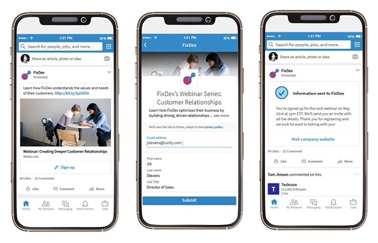
When you pair Document Ads with LinkedIn Lead Gen Forms, the form opens inside the app, automatically pre-populated with verified data from the user’s professional profile. This eliminates the tedious typing that kills mobile landing page conversion rates.
Because pre-filled forms reduce friction so significantly, advertisers are often tempted to ask for too much information. Requesting ten fields simply because the platform can populate them will trigger privacy concerns and increase form abandonment.
Keep your form lean:
-
Request first name, last name, and business email as your baseline fields.
-
Use LinkedIn’s verified profile data for job title and company name rather than asking users to type them manually.
-
Add at most one custom qualifying question. Make it a multiple-choice question that provides critical routing context for your sales team, such as team size, primary software stack, or timeline for addressing the issue.
Always configure the form to request work emails rather than allowing default personal addresses, as this protects the integrity of your marketing automation database and downstream lead scoring.
Post-Submission Fulfillment and Retargeting
Capturing the submission is only half the battle; how you deliver the document determines whether that lead translates into actual business pipeline.
Configure the completion screen of your Lead Gen Form with a direct Download Now link so the user can immediately open and save the PDF on their current device. Do not make them wait for an email to arrive in their inbox before they can access what they just requested.
Simultaneously, trigger an automated email from your marketing automation platform within two minutes of submission. This email serves as an archival copy for the reader, but more importantly, it provides an opportunity to offer a logical next step, such as a companion calculation template, an invitation to a private briefing, or a direct link to an interactive assessment tool.
Furthermore, use the engagement signals generated by the ad to build intelligent retargeting pools. Prospects who opened the document and swiped through multiple pages but exited before submitting the form are highly qualified accounts displaying clear topic affinity. Group these accounts into a custom audience and serve them secondary touchpoints, such as short-form video commentary, ungated executive summaries, or customer case studies that address the specific pain points explored in the whitepaper.
Moving from Gating to Value Exchange
The debate over whether B2B content should be gated or ungated misses the larger shift in modern buyer behavior. Prospects are entirely willing to share their contact information, provided the transaction feels equitable. What they refuse to tolerate is paying with their data before receiving any indication of value.
Using LinkedIn Document Ads to gate whitepapers properly transforms your demand generation from an aggressive tollbooth into an authentic value exchange. By giving away your best insights in the preview and reserving the tactical execution tools for the full download, you build immediate brand credibility, eliminate mobile bounce rates, and generate qualified leads who enter your funnel already convinced of your expertise.